Welcome to DataViz!
In this Section You Choose a Data Visual to Modify and Engage With.
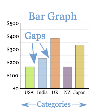
Bar Chart:
A data visual with rectangular bars with lengths equal to the values that they represent.
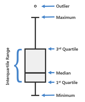
Box-Plot: A data visual that show groups of numerical data through quartiles.
A box plot displays median, higher/lower quartiles and maximum/minimum.
Outliers may be plotted as individual points.
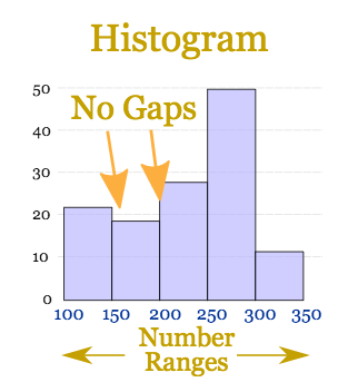
Histogram: A data visual that groups numeric data into bins, displaying the bins as divided columns.
Histograms have no gaps.
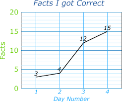
Line Plot: A data visual that shows information that is connected in some way (such as change over time).
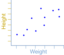
Scatter Plot: A data visual that has points showing the relationship between two sets of data.